|
Larry’s note: Welcome to Trading with Larry Benedict, the brand new free daily eletter, designed and written to help you make sense of today’s markets. I’m glad you can join us. My name is Larry Benedict. I’ve been trading the markets for over 30 years. I got my start in 1984, working in the Chicago Board Options Exchange. From there, I moved on to manage my own $800 million hedge fund, where I had 20 profitable years in a row. But these days, rather than just trading for billionaires, I spend a large part of my time helping regular investors make money from the markets. My goal with these essays is to give you insight on the most interesting areas of the market for traders right now. Let’s get right into it… |
There are all kinds of correlations that exist in the market. And as a trader, it’s important to know what these are.
The reason is simple…
If the price gap between two related products gets too far out of whack, the markets will eventually push them back to their normal range…
And that can provide some great trading opportunities.
For example, if the oil price rallies but oil stocks lag, you can expect them to eventually catch up.
Likewise with gold…
It’s the latter of these that I want to look at today…
We took a deep dive into gold last Wednesday when we checked out the SPDR Gold Shares ETF (GLD) – an ETF that tracks the gold price.
Today, I want to add another gold ETF to the chart. This time, though, one that tracks gold mining stocks – the VanEck Gold Miners ETF (GDX).
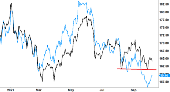
I’ve overlaid the two charts to show you how they move in relation to each other. So, let’s check them out…
GLD vs GDX

Source: eSignal
There’s a lot going on in this chart, so let’s unpack it…
The black line denotes GLD (gold price ETF) – the one we looked at last Wednesday. The blue line represents GDX (gold miners ETF).
As you’d expect, given the obvious importance of gold’s price to a gold miner, you can see how closely the two lines track each other…
That happened all the way through the three major moves on the chart: down from January to March, up from March to June… and then down from June until recently.
Now, we’re looking for nuances within this direct correlation that we can trade…
First, if you look closely at the third move down (from June onwards), you’ll notice that GDX went from trading at a premium over GLD to a discount. That is, from above the black line to below it.
In other words, when the gold price fell, gold mining stocks fell further.
Another thing you’ll notice is the size of the gap between the two lines.
This gap peaked in May and June (with GDX above GLD) before the move down… and peaked again last month (this time with GDX below GLD).
This tells me that if the gold price was to turn around and rally, we might expect this gap to close up again. So, while both GDX and GLD would rise, we could expect GDX to rally stronger than GLD.
That’s an important piece of information for a trader.
That’s why what happens next with GLD is key.
Take another look at the chart…
GLD vs GDX

You’ll notice that there’s a red support line for GLD. This represents a level ($161) that GLD held on August 10 and tested again (and held) on September 29.
However, while GLD held support, GDX (blue line) continued to fall. That’s what has led to the current disparity.
But there lies our trading opportunity…
If GLD continues to hold support and rallies, it might be GDX that benefits the most from this price disparity.
If GLD rallies, GDX could rally even stronger, giving us a more profitable trade.
Right now, it’s still early… we’ll have to keep watching to see how it pans out. But it could provide a promising trade for the future.
We all know that trading is about trying to gain an edge. That’s what puts profits in your trading account.
By studying correlations – how stocks or commodities move in relation to each other – you can firmly put the odds in your favor.
Regards,
Larry Benedict
Editor, Trading With Larry Benedict
P.S. We’re excited to hear what you think of your new eletter, Trading With Larry Benedict. Let us know at [email protected].